Data has become so valuable in business that many are calling it the new “oil.” In fact, countless companies are earning and saving millions of dollars a year from data analytics. But just like crude oil, crude data is worthless if you can’t refine it into something actionable – and that’s where data science comes into play. We hope this statistics cheat sheet will serve as a quick primer in data science.
As a CEO or CTO, you don’t need to understand the minutia of data science to boost your company’s income (that’s what data scientists are for!) but you should know the basics – especially when it comes to the statistics behind data science.
We don’t have room for a complete statistics primer in this article, but we can teach you about three important statistical concepts for data scientists.

1. What’s an Algorithm?
Every day we hear the term “machine learning algorithm” more often. For example, Google and Facebook use artificial intelligence and machine learning algorithms to analyze user behavior, and this helps them display highly-accurate, targeted advertising to internet surfers. But do you know what an “algorithm” is or what it means?
Many machine-learning algorithms are actually too complicated for humans to understand. That’s why data scientists who work with them have a hard time explaining why their computers make the decisions they do. However, in the simplest terms, an algorithm is a set of instructions that instruct computers to perform a specific operation. It’s like a flowchart that leads to a result when followed, and it offers procedures of action to take when specific conditions present themselves. With the same input, an algorithm will always result in the same output. For example, imagine a cookbook recipe for a cake. If you follow it precisely with the same ingredients and conditions, it will consistently produce the same kind and quality of cake.
The K-Nearest Neighbor Algorithm is one of the easiest to understand. This algorithm uses reasonable deduction more than it does statistics. It uses clustering to find the nearest neighbors of a particular group. The objects or models within the K-Nearest Neighbor Algorithm graph operate within a 2-dimensional space. In other words, you can graph their positions or “nearness” to one another on an x, y graph.
The K-Nearest Neighbor Algorithm is useful for feature clustering, basic market segmentation and finding groups within certain kinds of data entries. For example, imagine you want to target marketing to people in or near Boston. This algorithm lets you identify people in or near Boston within the radius of space that you specify.
2. What Are Discrete Variables and Continuous Variables?
Discrete variables relate to limited sets, i.e., a “countable” number of things. For example, it’s easy to count the number of beans in a jar to arrive at a specific number. But counting someone’s age is a different story.
Imagine you’re counting someone’s age. The person can’t be 28, but he or she could be 28.19817199… In fact, this fraction will go until infinity. Unlike a discrete (or countable) this “uncountable” variable is known as continuous.
As you might have realized, it’s impossible to know a continuous variable in its fullness because counting it goes until infinity. Therefore, rather than writing continuous variables with a specific number, data scientists and statisticians need to present them with a formula. Measurements like time, weight, and temperature are continuous variables like this.
3. What Are the Most Common Statistical Distributions?
The most common statistical distribution is known as a normal distribution or “bell curve,” but that’s not the easiest to understand. The easiest to get a sense for is the Bernoulli Distribution, so we’ll start with that.
Bernoulli Distribution
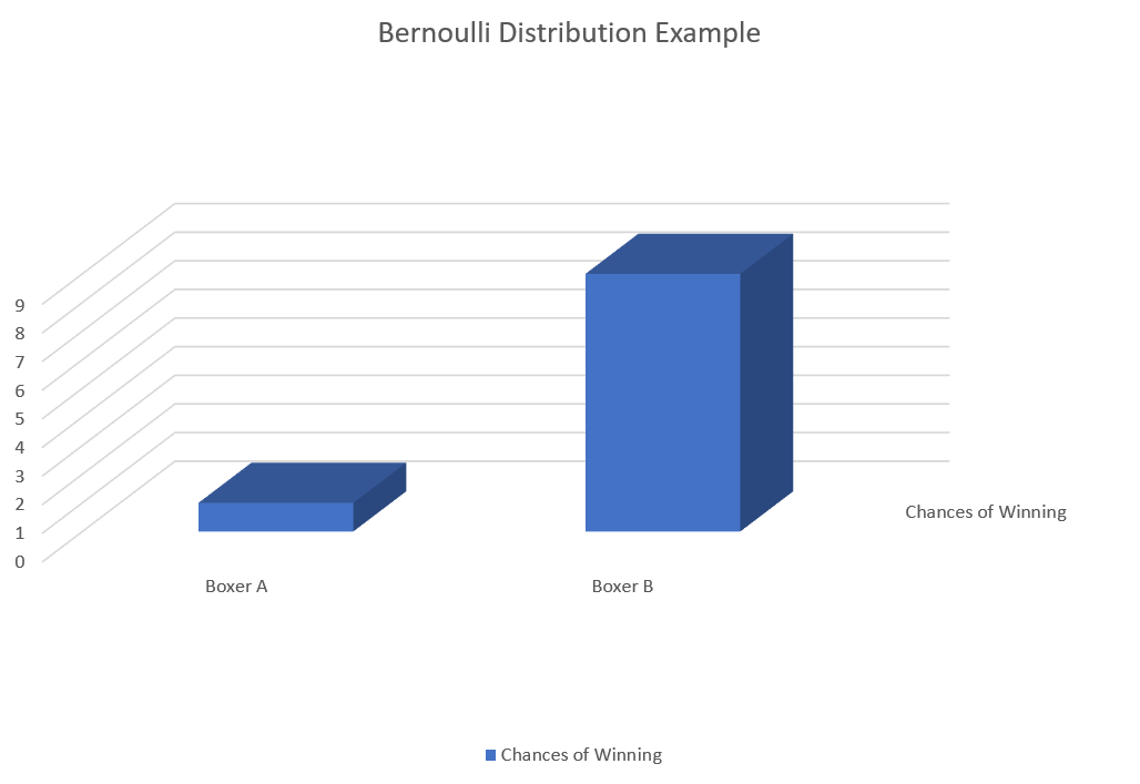
Like a flip of a coin, the Bernoulli Distribution can only have two possible outcomes: 1 or 0. If flipping heads gives you a “1,” and tails gives you a “0,” then the probability of getting heads or tails is the same (i.e., 0.5).
However, a Bernoulli Distribution – or the chances of one of two outcomes happening – doesn’t have to be equal. For example, the when looking at a statistical past, the probability that a boxer winning (after he won 10 of the last 10 matches) against another boxer (who won zero of the last 10 matches) is not going to be a 50-50 chance. Instead, it might look something like this:
Uniform Distribution
In the case of a uniform distribution, the outcome of any of the possibilities happening is equal. Whether there are two or seven possibilities, the chances of getting one outcome will be the same as any of the others. As such, unlike a curved graph, the graph of a Uniform Distribution is flat, like this:
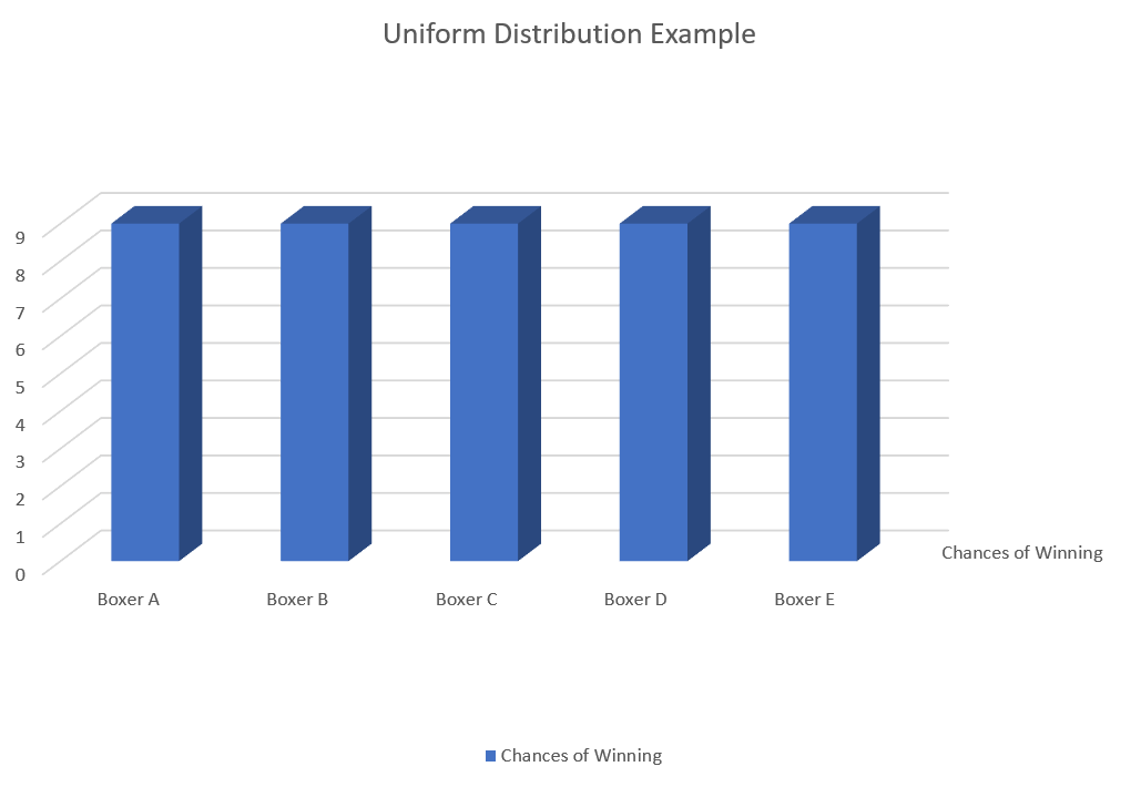
It’s because of the rectangular shape of a Uniform Distribution that they are also referred to as a “rectangular distribution.”
Binomial Distribution
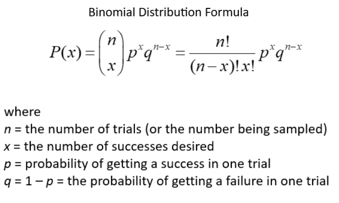
A Binomial Distribution involves two distinct outcome possibilities like a Bernoulli Distribution. The difference is this: In a Bernoulli Distribution experiment, you might ask one person in your town if he planned to vote for presidential candidate A or B, while counting votes for A as a success and votes for B as a failure.
In a Binomial Distribution experiment, you would ask all of the people in your town if they voted for A or B and record the number of successes. Assuming that every person has the same probability of choosing A and the tests are done independently, this would be a Binomial Distribution experiment.
Here’s what the mathematical formula for a Binomial Distribution looks like:
Normal Distribution
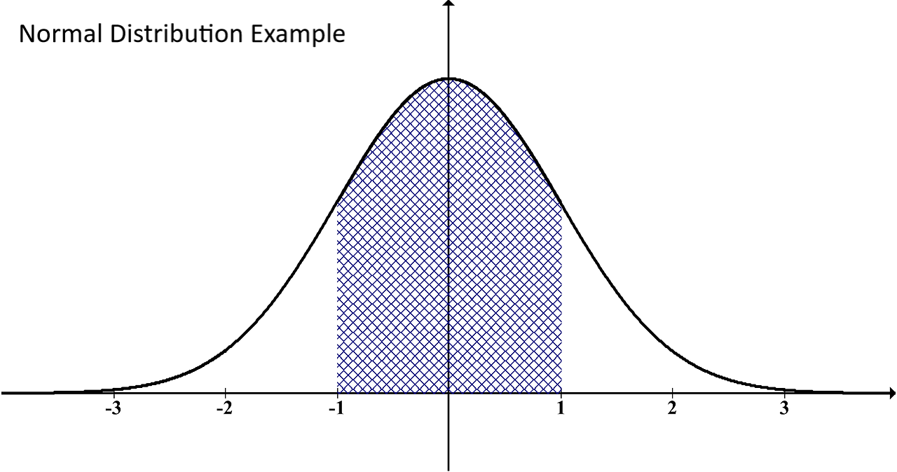
A normal distribution is often a natural occurrence (hence the name). It’s typically seen in the results of standardized tests where multiple results are possible. For example, an equally small percentage of students scores an A or F, while a larger but the percentage of students may score a D or B, and the largest (or average) percentage scores a C.
When plotted on a graph, a normal distribution forms what looks like a bell:
Poisson Distribution
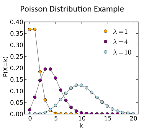
A Poisson Distribution is the name of a random distribution. In the simplest of terms, these distributions happen in random numbers during random periods of time. For example, imagine figures:
- 911 calls on a specific day.
- Vehicle crashes during a specific month.
- Typos in a given article.
- Dog bite attacks in a country during a specific week.
The Poisson Distribution relates to any events like those listed above that happen randomly. In these cases, the only interest is in how many of them happened.
The assumptions you need to prove for a Poisson Distribution to exist are:
- A successful event doesn’t influence the success of later events.
- The success probability within a short period of time is in the same as the success probability within a longer period of time.
- The shorter the interval, the closer the probability of success gets to zero.
Here’s what the formula of a Poisson Distribution looks like:
Grow Your Business and Do It With Data
The topic of statistics in data science is a big one, and it would take several books, many hours of reading, and years of code writing before you fully understand this topic. That being said, we hope this brief review gets you started on the right track to growing your business with data.
At ironFocus, we aren’t just data scientists who write code and punch out queries. We understand marketing, sales, business operations, and especially, how big data and machine learning insights can dramatically improve all of these areas of your business. If you’d like to find hidden potentials in your business that only the most finely-tuned insights and algorithms can reveal, contact us now. We’ll listen to your story and tell you how we can help.


Comments are closed